
Project Summary
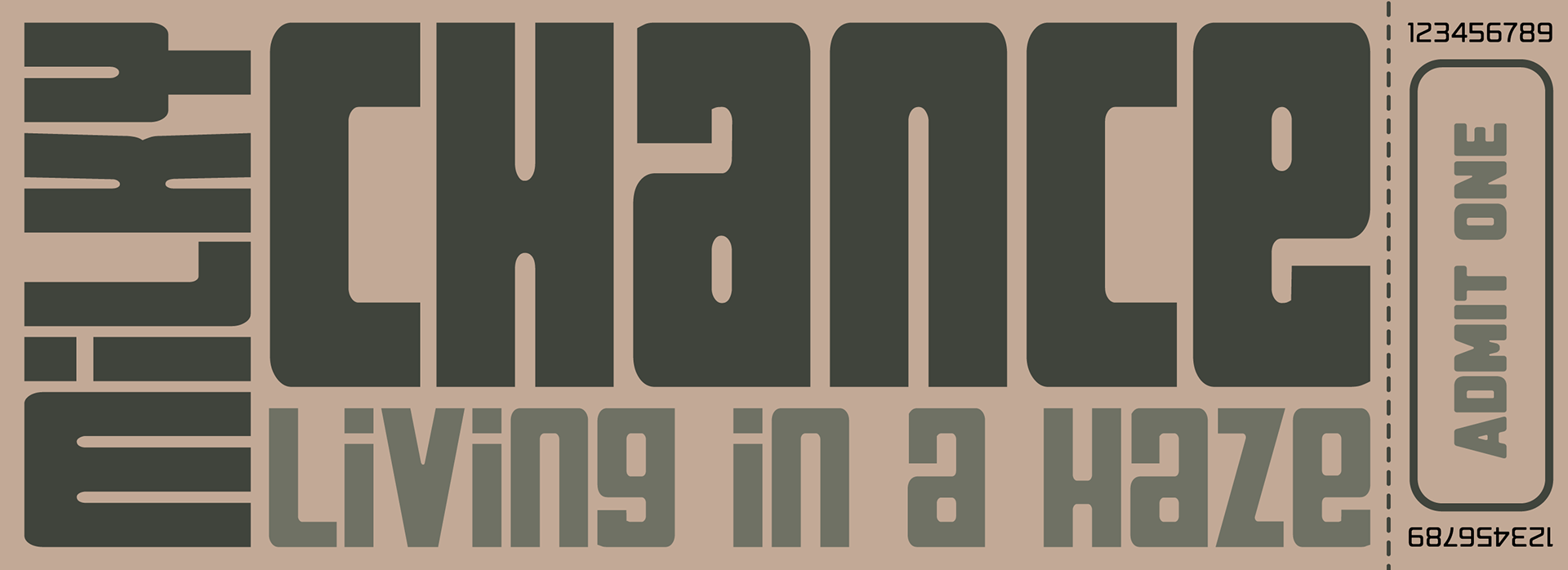
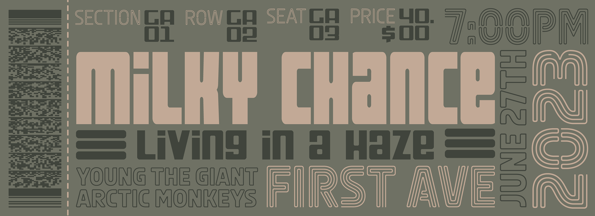
Objective: The project aimed to create an eye-catching and informative 18" x 24" poster and accompanying tickets for a concert featuring our favorite band at First Avenue. The design included essential details such as venue name, show date, opening acts, barcode, and age/ID requirements.
Components:
1. Poster Design (18" x 24")
Main Image: A visually appealing image of the favorite band, serving as the focal point.
Venue Information: Clearly displayed "First Ave." to highlight the concert location.
Show Date: Prominently featured to inform potential attendees.
Opening Acts: Names of two opening acts to build anticipation.
Ticket Access URL: Provided for easy access to purchase tickets online.
Age and ID Requirements: Clearly disclosed to ensure attendees are aware of any restrictions.
2. Ticket Design (Front and Back)
Front of Ticket:
Date and Time: Clearly stated for reference.
Location: Venue details for convenience.
Fees: Transparent information about any additional fees.
Seating/GA Info: Indication of seating arrangement or general admission details.
Showtimes: Displayed prominently for attendees' awareness.
Back of Ticket:
Additional Information: Space for any extra details or disclaimers.
Design Elements: Consistent with the overall theme of the poster for a cohesive look.
Design Process
Initial Concept: The design process commenced with the idea of constructing a graphic featuring a living room suspended in the clouds. The intention was to evoke a sense of delusion or fogginess, providing viewers with a surreal experience. This concept aimed to capture an otherworldly atmosphere, aligning with the theme of uncertainty and allure.
Challenges and Evolution: However, as the design progressed, challenges arose in translating the living room in clouds concept effectively. Uncertainty about how to execute this idea led to a reevaluation of the initial concept. The decision was made to pivot and explore a new direction that could still encapsulate the desired emotions.
Revised Concept: Drawing inspiration, the revised concept shifted towards a classic armchair placed outdoors in the fog. The visual focus was on the armchair, set in a dimly lit environment, with a spotlight casting a unique illumination on it. This adjustment aimed to maintain the essence of uncertainty while offering a more tangible and relatable scene.
Intention and Emotions: The primary goal of the revised design was to convey a blend of conflicting emotions, including uncertainty, allure, calmness, and comfort. The fog served as a metaphor for the ambiguous and mysterious aspects of the theme, while the spotlight emphasized the allure and spotlighting of certain elements amidst the uncertainty.
Symbolism: The choice of a classic armchair symbolized comfort and calmness, contrasting with the surrounding fog. The outdoor setting and unique lighting created a scene that invited viewers to reflect on the interplay of uncertainty and familiar comforts.
Execution and Type Work: The design execution involved careful consideration of lighting, shadows, and composition to achieve the desired atmosphere. Attention was given to type work for the poster and tickets to ensure clarity and visual harmony. The spotlight effect on the chair was meticulously crafted to enhance the overall visual impact.
Feedback and Success: The final design received positive feedback, with specific praise for the type work and the main image of the armchair in the fog. The success of the project lay in the ability to adapt the concept, incorporating elements that effectively communicated the desired emotions while maintaining visual appeal.
In conclusion, the design process showcased the evolution of ideas, the challenges faced, and the creative decisions made to achieve a visually compelling representation of uncertainty, allure, calmness, and comfort in the context of a concert poster and tickets for a First Avenue event.
