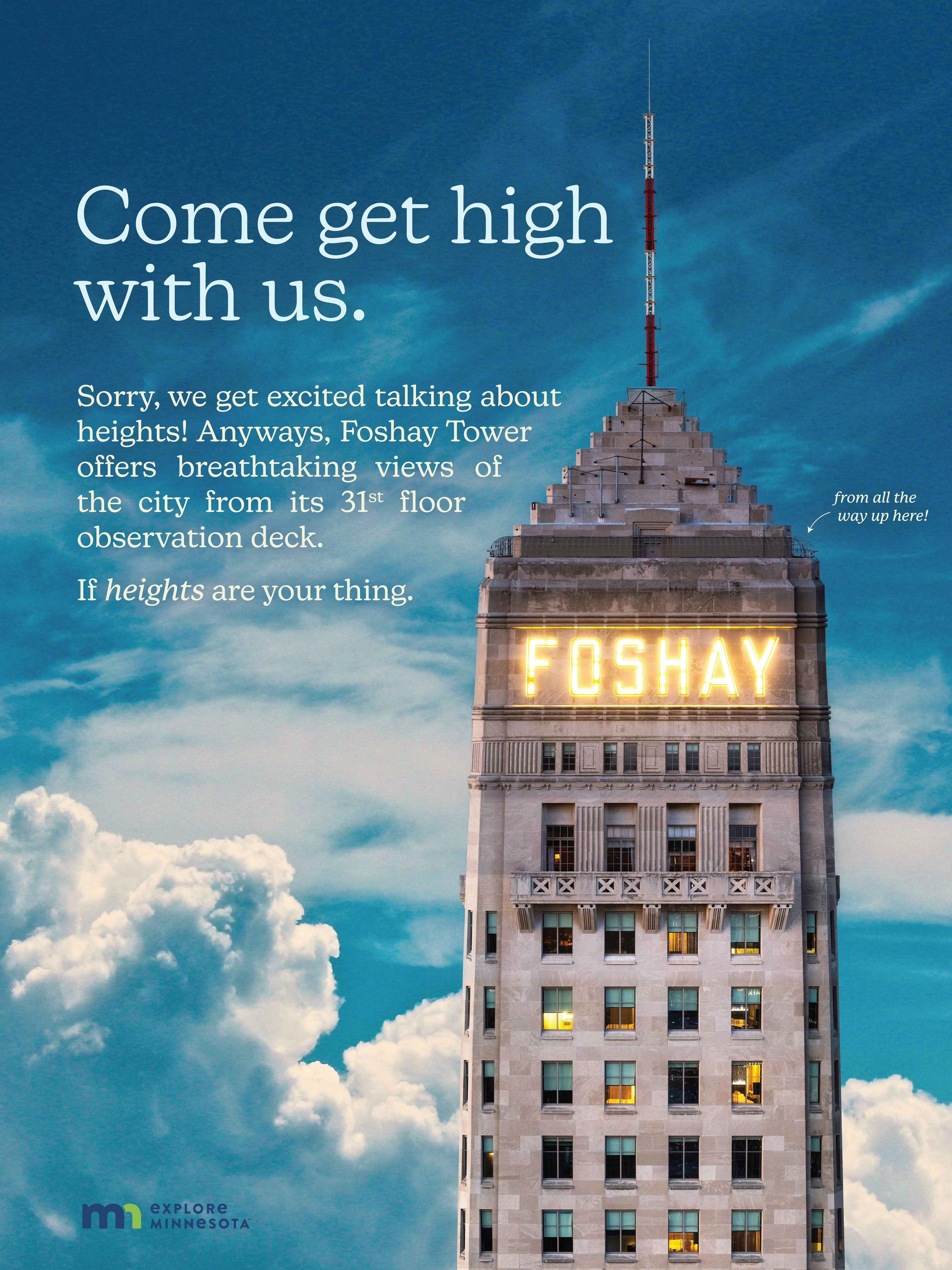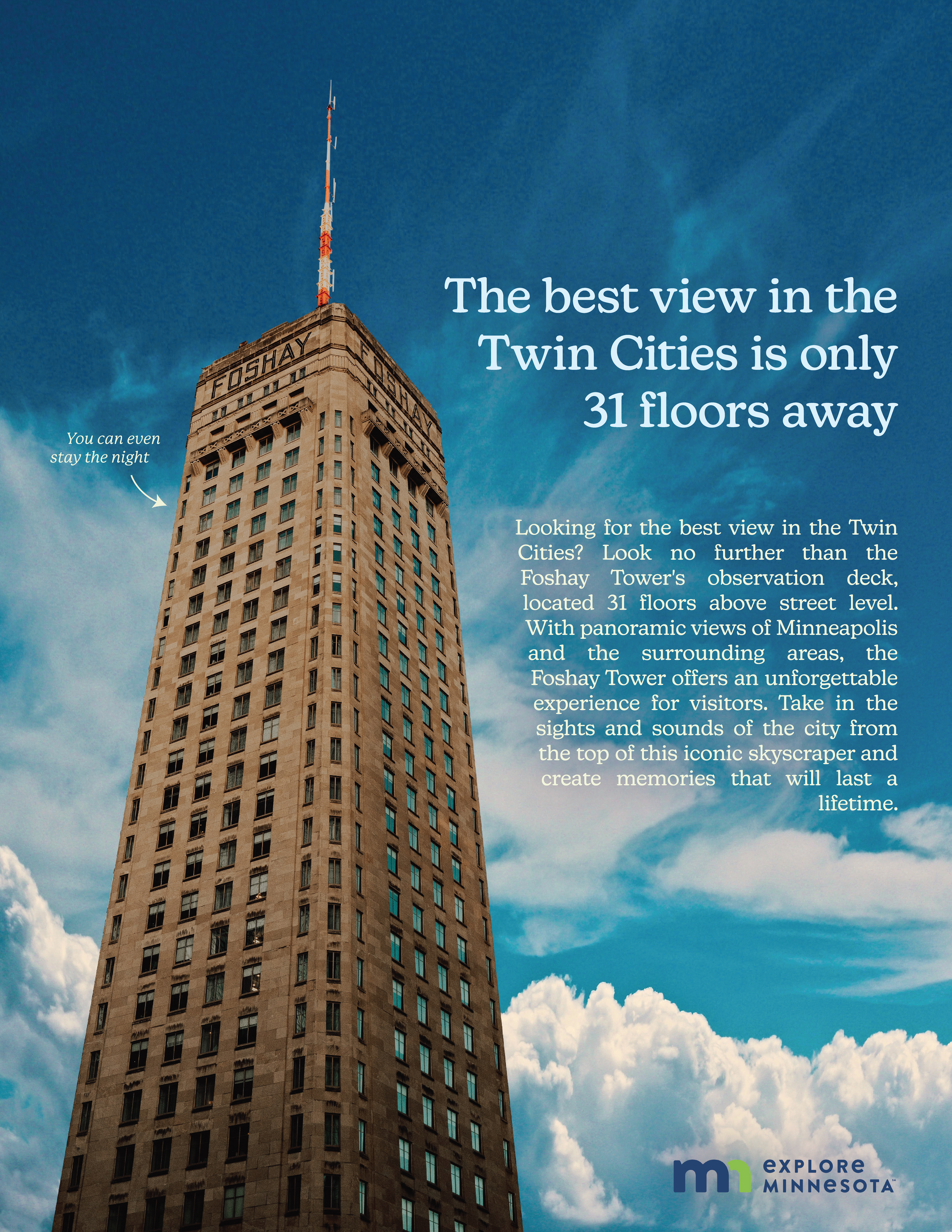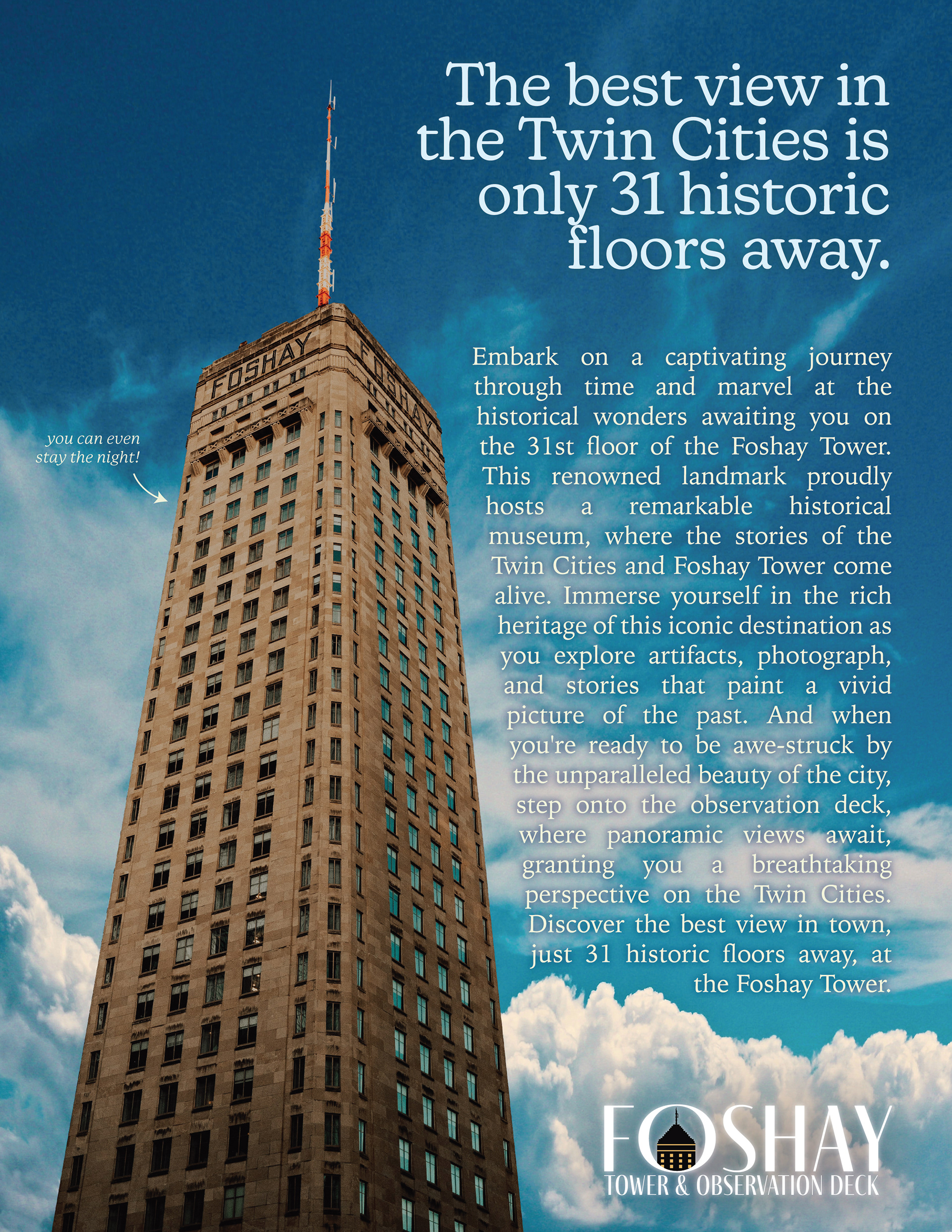


Pictured above is the first draft. Pictured below are the final edits.
A Foshay logo was designed to highlight the brand and individual experience that the brand has to offer. The background imagrey in the double page spread was modified to not include the Foshay Tower within the skyline, as that wouldn't make any sense! The copy was specifically fine-tuned to create a common message and tone between the three ads. Overall, a more consistent and concise brand image and message was deployed as a result of the modifications from first draft, to final.


This campaign was submitted for the November publication of Communication Arts.This magazine puts out 6 annuals each year for six disciplines of design (web, illustration, photography, graphic design, advertising, and typography). This campaign was entered into the Advertising Annual Competition, where finalists will be featured in the Novemeber 2023 Annual.
