Sleeping Bear Dunes Poster

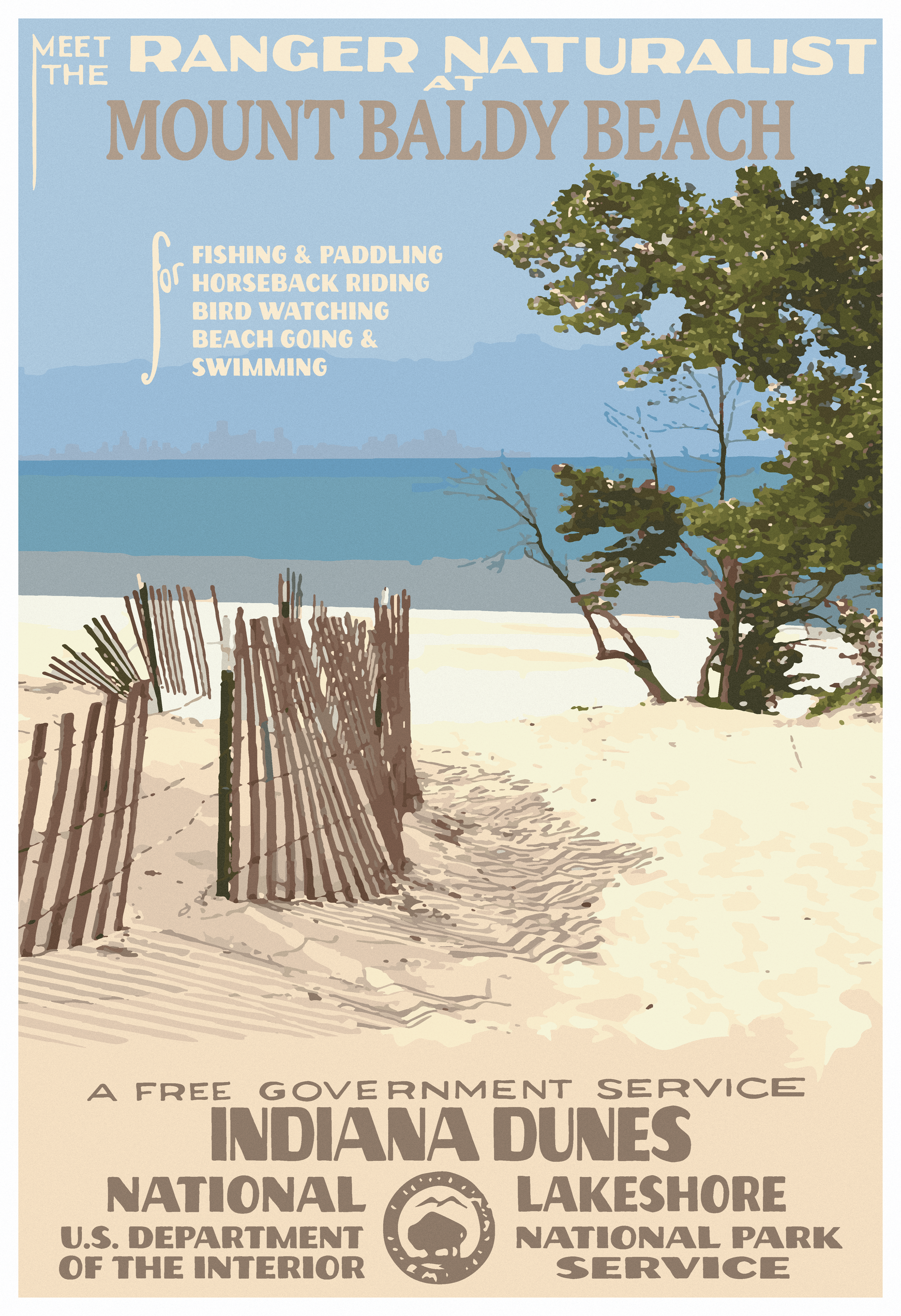
Indiana Dunes Poster

Apostle Islands Poster

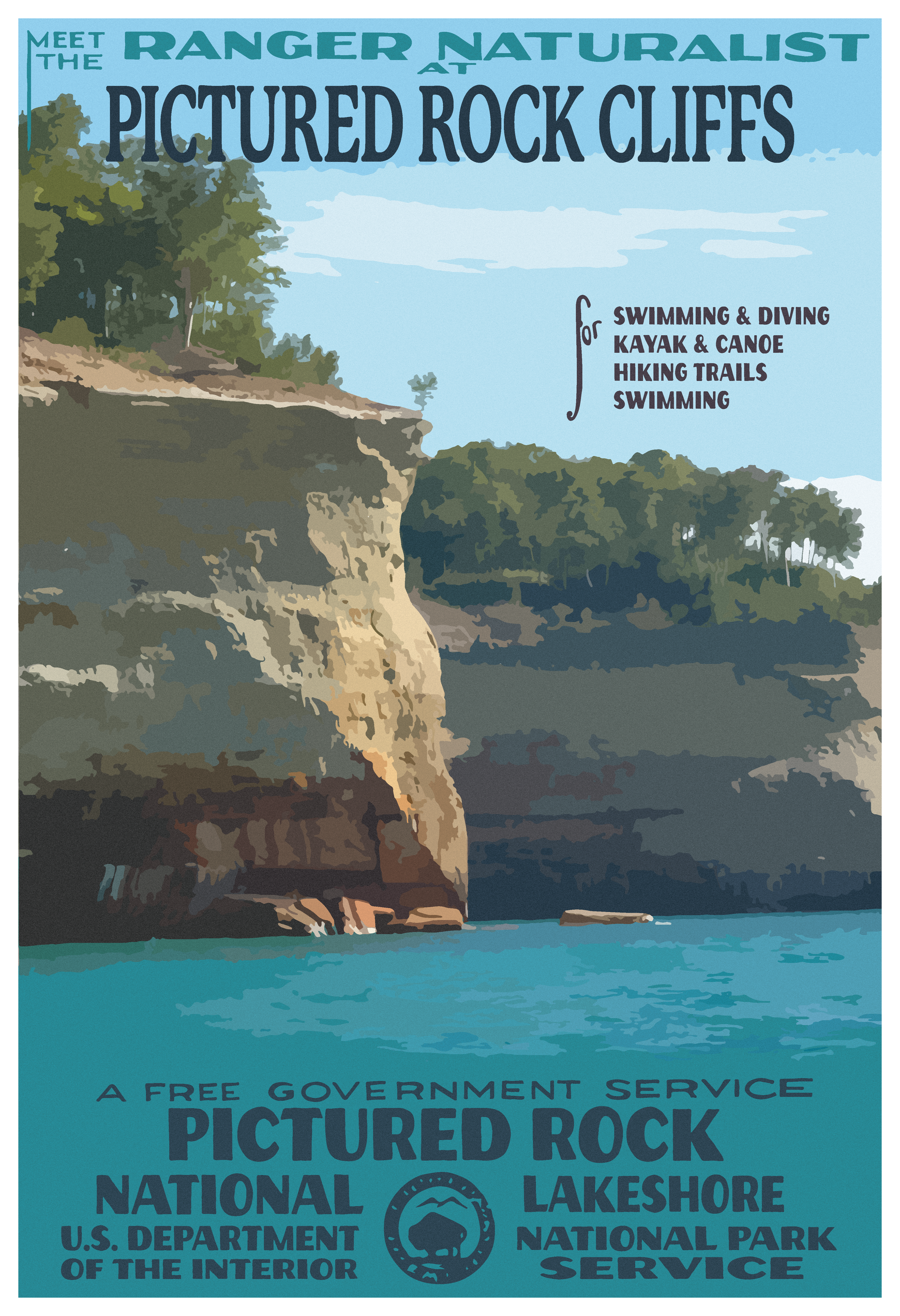
Pictured Rock Poster
Project Summary
Objective: The project aimed to redesign three posters in the Works Progress Administration (WPA) style for national lakeshores, evoking the spirit of the 1930s while employing authentic design elements. Each poster, sized at a minimum of 11" x 17", was intended to promote the beauty and recreational opportunities offered by the national lakeshores, captivating viewers with vibrant illustrations and compelling typography.
Components:
Poster Redesigns (11" x 17")
Illustrations: Vibrant and stylized illustrations depicting scenic landscapes, recreational activities, and iconic landmarks found within the national lakeshores.
Typography: Bold and dynamic typefaces reminiscent of the typography prevalent during the WPA era, carefully integrated to convey key messages and attract attention.
Colors: Thoughtfully chosen color palettes inspired by the natural beauty of the lakeshores, with bold contrasts and harmonious tones to enhance visual appeal.
Design Process
Creative Brief: The approach for this project was inspired by a desire to pay homage to the iconic WPA posters while reimagining them through a contemporary lens. By infusing the designs with elements of the WPA style, we aimed to capture the essence of the national lakeshores and inspire viewers to explore these natural treasures.
Concept: The design concept centered on celebrating the beauty and diversity of the national lakeshores through captivating illustrations and bold typography. Drawing inspiration from the WPA era, the posters were designed to evoke a sense of nostalgia while remaining relevant to modern audiences.
Execution: Attention to detail was paramount in executing the redesigns, with a focus on authenticity and historical accuracy. Typeface selection and rendering were carefully considered to align with the design era, while colors were applied thoughtfully to evoke the natural landscapes and attractions of the lakeshores.
Overall Design: Each poster was approached holistically, considering front and back elements to ensure a cohesive and unified design. Content such as park names, activities, and informational text received equal design attention, maintaining visual balance and clarity throughout.
Feedback and Success: The final designs received positive feedback for their authentic homage to the WPA style and their ability to effectively promote the national lakeshores. Viewers appreciated the vibrant illustrations, bold typography, and cohesive design elements, which collectively captured the allure of these natural destinations.
In conclusion, the redesign of the national lakeshores posters in the WPA style successfully marries historical design aesthetics with contemporary relevance, serving as both a tribute to the past and an invitation to explore the beauty of America's lakeshores. Through careful consideration of concept, execution, and overall design, the posters inspire admiration for these natural wonders while honoring a rich artistic tradition.
